Learning Activity – Customize a WordPress Site

Take your theme that you have installed on your hosting account and customise it as per this module. Then I want you to find some WordPress hacks that you can use to customise your website even further. The main thing with this project is to not just do things for the sake of doing them. I would like you to explain the tweaks that you have made and your reasoning for adding certain features. Please upload a Word doc along with your assignment, so that I can see why you’ve made certain decisions.

Link to my WordPress website: https://www.donnatranngo.one

LA – wordpress

Learning Activity – Working with WordPress

Firstly you need to download and install WordPress. Then publish it to your web hosting account. Create a subfolder if you wish to avvoid conflicts with previous websites.

After all the “admin” is complete, you can start having some fun.
Choose and download a theme that best suits you and install it. Then customise this theme in order to create a portfolio website for yourself.


I am very busy the next two weeks. I haven’t had much time to do this learning activity but will try my best to do it all later. Here is a link to my portfolio. It is not done at all, but this is what I made with the time I had.

https://www.donnatranngo.one


Learning Activity – Point of Sale

Part A

Consider the touchpoints of your brand in general (to ensure that all the elements work together) and then focus on your packaging. Design a set of Point of Sale elements that will promote your product in-store. The set can consist of however many elements you choose. It can be in any format that you would like it to be. Please consider the following:

  1. Can customers clearly see your product in your Point of Sale elements?
    Do you use your Point of Sale to also showcase your actual product?
  2. Brand Integration
    Does it integrate with the brand’s look and feel?
  3. Designed to sell!
    Does it persuade customers to buy your product?

Part B

Brand manual.
Take pictures of your elements and include them in a presentation of your brand called a brand manual or a design manual. Your brand manual should have a minimum of 7 pages and include logo, color scheme and chosen typography as well as the different elements produced during this 4 week project period (brochure, infographic, packaging, point of sale).
Hand in your brand manual as a PDF.

Tip: Take a picture of a shop’s interior and use Photoshop to show your Point of Sale elements within a “real” environment.


Part A:

The first thing I got in mind when working with this task was that I wanted my dog food to be displayed in a cardboard stand. The stand could have the same style, colors and elements as all my products from this task. The cardboard would be big and draw a lot of attention, but to get more attention I decided to put “stickers” of the logo on the floor that would lead to the dog food. I tried my best to make a cardboard in the program Adobe Illustrator, and places it in a picture. Below are both of my result:

pointofsale

pointofsalestickers

pointofsaleflatpack


Part B:

Brandmanual

Learning Activity – Packaging

Using the logo you created in Week 1 and the brochure you designed in Week 2, think about your brand and design packaging for your product. Remember that you can decide about the detail of your product. Is it dog biscuits, meat products in a tin, dry pellets or a new and exciting product?

Do your design according to the following steps:

Exploration
Use sketching techniques to draw thumbnails and hand in your thumbnails as scanned PDFs.

Sketch – Packaging

Sketch – Packaging 1

Brand integration
Choose one of your thumbnails and refine your design. Place it next to your brochure and logo and see how you can merge your design with the brand identity. Also, what fundamentals of the brand can you draw from and use in your design?
Hand in a picture of your thumbnails, mock-ups, logo and brochure together.

I chose to work with sketch number 3.

Sketch – Packaging 2

Sketch – Packaging 3

packlogobrochure

Design
Now design your packaging properly, using any design application of your choice (or a combination of e.g. Photoshop, InDesign and Illustrator). Export the flat design as a PDF.

I used the programs Adobe Illustrator and Adobe InDesign to design my flat packaging. I used many of my ideas from the brochure.First attempt:

Flatpack 

The first design looked good and it was consistent with the brand and flowed well. The package worked well in layout but the front could use a bit more love and attention to details. It could also have some elements that made it look more believable, like weight, flavor and a description of what it was inside the box. The front would also look better with an image or graphic element that communicated the theme ‘dog’.

Second attempt:

Flatpackaging

The second attempt was the look I wanted to go for, but after some feedback I decided to change it. The feedback I got was that the packaging made it look like the food was for puppies, which I agree with!

The final design:

Flatpackaging2

The final design is more interesting and has more believable elements. The picture of the dog makes it easier for a buyer to know it is food for dogs. The color of the writing in the green part is also changed from black to white to make it more visible. The weight for the food is put in a darker part and is also in white writing.

Presentation
Make a life-size mock-up of your final design and take photographs of it. Remember that you can take more than one photo to show the different angles and sides of the packaging. Here your presentation skills are vital. How do you present the final mock-up in a photo to reflect the true essence of your design?

I printed out my final design and taped the sheets to a box I had at home. My packaging is suppose to be a A4 size, but I did not have a box that was the right size. Therefore, I printed a smaller version and taped it to a small box. Below are the pictures of my second packaging and final design, and also a mockup made in Adobe photoshop.packaging.jpg
42600681_2185254438153839_2725652882459197440_n.jpg
42683478_309258629858326_3628306569713680384_n.jpg
42641607_341391529941597_5190201650588942336_n.jpg
42763940_303392853592409_2953142800318726144_n.jpg


Here is a mockup and a picture of the final packaging:

box2.jpg

43622194_181477342752219_2572522240201457664_n.jpg

Learning Activity – Illustration, Infographic and Brochure

Learning Activity – Illustration, Infographic and Brochure
Practical assignment (observation and analysis)
Use the logo you created in Week 1 and design a brochure for your product. You may use any format you like, just make sure that the format is in line with and adds to your logo design. Your brochure must contain an illustration. This could be the infographic alone, or it could be the infographic and the rest of the brochure (in other words, the entire brochure may be illustrated if you’d like).

When designing the brochure and creating your illustration, make definite use of the fundamentals of visual language as discussed in this lesson.
You must illustrate an infographic and design a brochure:

1. Illustration of infographic

The brochure design and infographic illustration should work together. Consider the format and style of your brochure and illustrate an infographic using fictitious data (or you could do research to get a better idea of actual statistics). The infographic must display the nutritious benefit of your product to dogs. It should contain the nutritional value, as compared to the necessary nutrition intake of dogs. It must also give an indication of consumption per size of dog. You may also add information of your choice that you think is relevant.

2. Design of brochure

Design a brochure that introduces your product and includes the infographic illustrated in Question 1. You can decide on the information and format of your brochure. As a guideline, consider a brochure of A4 (lying), folding to A5 (standing). You don’t have to have more than four pages in your brochure (but it depends on your design and style). You must base your brochure design on the design of your logo. Thus, look at your logo and design a brochure that complements and blends in with it.


Here is my first attempt of my brochure. I might do some changes before delivering, but I think it looks ok for now. The design is flat and simple. I tried to keep my color palette the same throughout the brochure.

Brochure


EDIT: After some feedback I decided to add one more color to my palette. I made the brochure more interesting considering the content layout, the front page and the use of color. Below is my new brochure.

BrochureDogTreat

Learning Activity – Create a Logo

Develop a name for a dog food product. Design a logo for this product, using full colour. The logo must contain a main visual and typography. (Use the “People Saving Pets” logo as a guide – this does not mean your design should be the same, it is simply an example.) Follow each of the fundamental steps outlined above, in that sequence and take note of what needs to be handed in as you progress through these steps:

  1. Exploration
    Use sketching techniques to draw thumbnails and hand in your thumbnails as scanned PDFs.
  2. Focus
    Highlight three of the thumbnail ideas that you consider the best options and state why. Hand in an A4 with visuals of the three chosen thumbnails; include reasons for choosing each of these three options.
  3. Construction
    Use sketching techniques and redraw ONE of your chosen concepts until you’ve reached a conclusion on a successful logo. Hand in your drawings as scanned PDFs.
  4. Testing
    Experiment more with your favourite options from Step 3 and ask the opinion of a few people. Hand in examples of the logos shown to people and write their feedback or opinion on each.
  5. Refinement
    Choose your final design and execute it in Adobe Illustrator, along with the name of the product. Hand in your final logo as an A4 PDF.


Exploration: I used the creative method to come with ideas for names. I started of by writing many words I wished the brand should represent. Some of the words were friendly, yummy and healthy. All of the words I wrote on my paper made me come up with the name ‘Dog treat’. It is not too creative, but it is a suiting name for this kind of dog food. I again used the creative method to create a logo. I made some sketches on a piece of paper with a pen. I already knew what I wanted my dog food to be named. The sketches I made were all connected to the animal ‘dog’ somehow, either it was a dogs bone or a dogs face. Below are my scanned A4 PDFs.

Sketches-name
Sketches-logo

Focus: My favorite sketches were sketch number 1, 2 and 6. The reason why I chose these three sketches was because they were all different to each other and had good potential for a good logo. I tried to sketch them again on a new piece of paper to see which one I liked the best with a small description of why I liked the logos.

Sketches – logo 2

Construction:

Sketch logo 3

Testing: I created the chosen logo in the program Adobe illustrator. I asked my friends and family to give me some feedback on my logo. Below are pictures of the different designs and the feedbacks:Skjermbilde 2018-08-23 kl. 20.17.47.png
Feedback: The logo looks nice and is simple. The color might be too soft which could make the logo less visible.

Skjermbilde 2018-08-23 kl. 21.15.00
Feedback 2: The color brings forward the logo and represent the “healthy and active” theme well, but the color might be too bright. Try to center the logo and maybe use some black in the logo to take some of the brightness of the green color away.

Skjermbilde 2018-08-28 kl. 12.13.01.png
Feedback 3: The logo looks more professional and interesting, but it reminds of a beer logo because of the modern twist to it. It could work, but the other logo work better for dog food. A mix between this logo and the other logos could be a suiting chose for the brand.

Refinement: I appreciate my friends and family for their honesty. I agreed on what they ment and tried to create a logo that was a mix of all my earlier options.I tried to work more on the first logo I made. The biggest changes I did was to make the circle in the middle around the icon smaller, and the brand name bigger. The new color on the logo is softer which I feel works more with the clean and flat approach of the logo. The icon is also dark in color which makes it stand out more. Below is a A4 PFF file of my final result.

dogtreatlogo

This is just a quick example of a bag with the logo on.

dogtreat.jpg

Learning Activity – Market Your Website

Learning Activity – Market Your Website            (7 hours)
Now that you have built and tested your website, I would like you to market it. Let’s say that your budget is NOK 10 000 (or 1800 $ US). Please do the following:

  1. Do some research on what advertising costs. You could for instance contact your local newspaper, print shop and other websites.
  2. Make a detailed list of how you would market your website. Remember to keep your budget in mind.
  3. What if you had double the budget? Come up with a second marketing strategy, this time with NOK 20 000 at your disposal. (3600 $ US)
  4. Come up with a viral idea. It doesn’t have to be a video; it can be guys dancing at the airport in gorilla suits. You can use ANYTHING that is at your disposal. Be creative!

1.

My local news paper is called Kristiansand Avis. They used to have both paper version and online version, but from the 1st of January they closed down the online version due to a lot of costs. For the paper version it costs around 8000 kr to have an announcement for four weeks. I think it is to expensive for a announcement in this newspaper. I would rather spend more money on flyers and brochures and place them around in stores. For online advertisement I would use Facebook advertisement. This costs less which means I could advertise for my website much longer and I believe it would reach out to more people.


2.

Skjermbilde 2018-06-23 kl. 11.30.03

3.

I would advertise through commercials through Youtube and at the local cinema. These two advertisement methods works well to reach out to all kinds of people.

4.

I would reach out to Hollywood and ask someone famous to come and visit Kristiansand to attract people to the city. I would ask them to post pictures on Instagram and snapchat about all the beautiful places in the city, and what to do here. This would reach out to the whole world.

Learning Activity – Coding Basics

Learning Activity – Coding Basics                       (10 hours)
Take the basic website you have designed in your previous two Learning Activities in this module (Learning Activity – Put Thought Into Your Design and Learning Activity – Planning the Structure) and convert that into HTML and CSS code.

This will help you understand the importance between the design and the programming phase and how they work together.

Don’t stress if you can’t get everything right, just do as much as you can.

Here is a link to my website: http://donnatranngo.one/Kristiansand.html

The website is far from perfect and the ‘text boxes’ did not turn out how I wanted them to, but I feel like I understood more of the importance between html and css coding. The links on the webpage work, and this is a big personal accomplishment. I found coding very difficult in MA 05 and I am therefore happy about my work in this learning activity.

Learning Activity – Planning the Structure

Learning Activity – Planning the Structure         (3 hours)
Create the structure of your web page (from Learning Activity – Put Thought Into Your Design) in terms of HTML files and folders. You need to set these up so that you are ready to code your website.

First use a pen and paper to do your planning; then do it on the computer when you are sure of your structure.

Please upload this activity to your WordPress blog. Remember to scan and include your initial planning that you did on paper.


May-25-11-43-2018.jpg


Skjermbilde 2018-05-25 kl. 11.37.29.png


Learning Activity – Studio Lighting

Question 1

(30 min)                                                              

Written assignment
  1. Name three lighting sources and their functions.
  2. Name two light modifiers and explain the difference between them.
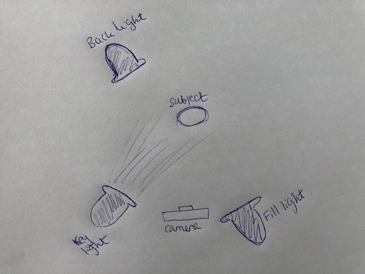
  3. Draw a diagram of and describe the three-point lighting setup.

Question 2

(2 hours)                                                                      

Research assignment
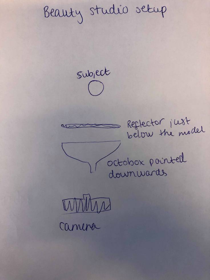
  1. Draw three studio setups for the following subject matters and list all the equipment that you would use to light your subjects:
    • Portrait
    • Fashion
    • Beauty
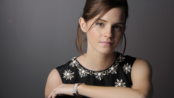
  2. In a magazine or on the Internet, find one fashion shot, a beauty shot and a portrait shot and explain how you think the lighting was set up in each shot.

Question 3

(2 hours)                                                                      

Practical assignment
Take some portrait shots and pay specific attention to the lighting you use. I would like to see a shot with soft lighting and one with more dramatic, harder lighting. It would be beneficial to hire studio lighting, but if you can’t, you may use natural light, reflectors and your camera’s flash.

Question 1:

1.

Hotlights, also known as tungsten lights, are called hotlights because they are really hot. Hotlights are ordinary quartz halogen lights, often around 500-800 watts, and they can be used for video and for when photographing small objects. The light don’t have enough power to take portrait photos of people because the ISO setting must be very high with a slow shutter speed. The light are also extremely hot, which can easily cause a fire, and be uncomfortably when shining in someone’s eyes. The color of the lights is a warm orange color which don’t mix well with daylight or flash.

Cool Lights are fluorescent and don’t run hot. These lights are therefore more comfortable for everyone involved, and it is not risk of them to get to hot causing a fire. The color is more or less similar to the daylight, so it is effective to use this light if there is daylight in a room. It can also be used in conjunction with flash. The power can very compared to the flash, so the problem with the ISO and the slow shutter speed is the same with these lights. The fluorescent lights can be adjusted by switching off one or more of the bulbs, but the range of adjustment is limited.

Flash is the favorite tool for studio photographers because it is the easiest to use while having the most power. It is a predictable and controllable light source that is very close to daylight color. It can be used to fill in shadows while shooting in daylight.

2.

Reflective umbrella: When you fire a flash into an umbrella, almost all of the light is reflected directly back at the subject. The shape of the umbrella forms a beam that is tighter or wider depending on the shape of the umbrella.

Soft box: The box is usually rectangular or square with a reflective inside and translucent front. This makes your light sources lager and more diffuse. Some soft boxes have a closed back where the light fires, reflecting light forward and adding softening. Others have an opening at the back which the flash fires forward, letting the front panel and inner baffles handle all the diffusion.

The spread of light is more contained with a soft box than with a reflective umbrella. The lights is more controllable though a soft boxes rather than an umbrella.

3.

Back light: The backlights are placed behind the subject. It provides definition and subtle highlights around the subject’s outlines, which helps to separate the subject from the background.

Key light: The key lights are usually the brightest/strongest and has the most influence on the look of the scene. Key lights are placed on one of the sides of the camera/subject to make the side well lit whole the other side has some shade.

Fill light: The fill lights are placed on the opposite side of the key light and it is used to fill the shade from the key light. It is usually less bright and softer.

31282784_2000240410000732_7824001894304448512_n.jpg

Question 2:

1.

31213776_2000248386666601_6913353726723883008_n.jpg31271236_2000248333333273_3587110720879198208_n.jpg31271256_2000248343333272_7554049752208244736_n.jpg

2.

fashion-makeover-and-photoshoot-24110906.jpg

Fashion: One back light behind the modell and one light behind the camera to the right. Maybe some umbrellas for reflection.

de7127f8e25d72cf3d0cbcf58fd39252--simple-wedding-hairstyles-bridal-hairstyles.jpg

Beauty: One key light to the left of the camera.

2485.jpg

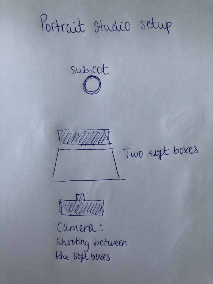
Portrait: One key light to the left of the camera. Maybe some soft boxes.

Question 3:

Hiring a photo studio was not an option for me, so I had to use the natural lights and the flash from my camera.

IMG_2525

Photo taken with a flashlight.

IMG_2534.JPG

Photo taken with some natural lights from the window and a ceiling light over the model.

Create a free website or blog at WordPress.com.

Up ↑